As a digital marketer, you need to ensure your content reaches a wide range of people with diverse needs. You can do this by making accessibility a central part of your content planning. If your content is accessible to more people, it brings benefits to all users.
What is accessibility?
What exactly is digital accessibility? And how can you ensure that your social media content is accessible?
Accessibility involves ensuring that your content is sensible, meaningful, and usable for as many people as possible. Ask yourself the following questions:
-
Will people with visual impairments get the same information as fully sighted users?
-
Will people with neurodiverse needs understand what you’re trying to convey?
It’s important to understand that accessibility isn’t about catering to the needs of a minority of users. It means catering to all users.
To make your content accessible, you should design and develop your creative assets (text, images, videos) in a way that ensures all users, regardless of their abilities or disabilities, can access, navigate, and engage with the content effectively. This includes accommodating people with visual, auditory, cognitive, and motor impairments.
Established guidelines such as the Web Content Accessibility Guidelines (WCAG) provide a framework for making web content more accessible to a wider audience. You can also check out our guidelines on accessibility and listen to our podcast episode on the importance of digital accessibility for more tips.
Why is accessibility important?
Accessibility is becoming an increasingly important issue for digital marketers for several reasons:
-
It benefits everyone: Accessibility broadens the potential audience by ensuring that more people can access the content. However, it also enhances the user experience for everyone. For example, well-structured, clear text can be appreciated by all users.
-
It improves SEO: Search engines favor content that follow best practices for usability.
-
It complies with legislation: Adhering to accessibility standards helps businesses comply with legal requirements. This reduces the risk of lawsuits and penalties.
-
It enhances brand reputation: By prioritizing accessibility, businesses can build a more positive brand image, foster customer loyalty, and create a more equitable digital environment.
-
It is the right thing to do: It promotes inclusivity. This helps to ensure that all individuals, including those with different needs, have equal access to information and services. This demonstrates respect for all users and upholds the principle that everyone deserves equal access to information and services.
Issues to consider
When developing an accessibility plan, you need to consider users with visual and auditory impairments, users with mobility impairments, and
neurodivergent users (who process information in sometimes different or unconventional ways).
-
Visual and auditory impairments: According to the World Health Organisation (WHO), there are approximately 2.2 billion people around the world who have some form of vision impairment ranging from mild to severe. This is why it is so important to consider alt text and screenreaders when crafting content.
-
Neurodiversity: Neurodiversity can be used to describe alternative thinking styles such as dyslexia, dyspraxia, autism, and ADHD. Regardless of labels, neurodiversity is about recognising those who think differently.
What is an accessible social media post
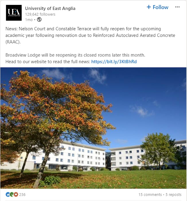
Consider this social media post. Why do you think it’s effective, from an accessible perspective?

Screenshot of simple post from University of East Anglia
The post is easy for read for several reasons:
-
It has clear line spacing.
-
Paragraphs are short and to the point.
-
The hashtags are at the end of the post.
-
The website link includes a description (not just ‘click here’)
Note also that there are no emojis or mentions in the post. While emojis and mentions are acceptable (and can be very effective) in social media posts, too many can be distracting.
Not all social media posts are this effective. Consider this example from UK food outlet Greggs. Their original post contained some unusual emojis which were, alas, unable to be read correctly by a screenreader: instead they came through as “blue square” and “yellow square”.
Screenshot of screenreader view of Gregg's sausage roll post
When the Royal National Institute of Blind People (RNIB) pointed this out to Greggs on LinkedIn, the company responded by committing to becoming more alert to accessibility issues in future social media content.
Best practices for accessible social media posts
Let’s consider some accessibility guidelines for social media posts in more detail.
1. Use clear, readable fonts
For social media posts, your text will use the platform’s default font. With some platforms, you can use a third-party tool to format the text (bold, italic, and bold italic). However, avoid over-formatting the text, because this can become distracting. Also, formatted text cannot be read by a screenreader.
You can use a variety of fonts in your images and as captions on your videos. While it can be tempting to use unusual or visually disruptive fonts,these are not always easy to read.
Table showing different text and display fonts. Source: Cary Anderson, Penn State University
2. Use appropriate color patterns
Avoid using color to convey information in your social media posts. The content should be carried by the words, not the colors. Visually impaired and color-blind users may not be able to distinguish between colors.
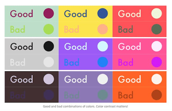
Also, consider your color combinations and patterns. What text color works best against what background? Aim for a striking contrast that avoids looking off-putting. In general avoid light-colored text on a dark background. For example, purple on a green background is easy to read, but light green on a green background is difficult to read. Similarly, blue on a yellow background is easy to read, whereas pink on a yellow background is difficult. The key is to have a contrast between the font color and the background color, with a dark color on a light background working best.

3. Provide image descriptions and alt text
When images contain information not already included in the text, you need to provide alternative (alt) text. This is a concise textual information used to accurately describe the visual details of the image that displays within a screen reader. There’s no need to include ‘image of’ or ‘picture of’ in the alt text.
If the image includes text (such as a testimonial quote), you need to add the text to the description. And use personal characteristic identifiers (eg age, gender, race) in the description when needed.
Avoid using emojis, links, and hashtags in alt text. They will not be clickable.
Note: Check the platform-specific guidelines for adding alt text to an image. On LinkedIn, for example, you click the ALT button to add the alt text.
Pro tip: Where possible, ensure the text contains all the necessary information, so that the image merely complements or illustrates the text. When the image doesn’t contain any information not included in the text, or is simply decorative, you don’t need to provide alt text.
4. Provide captions and audio descriptions for videos
Videos, especially short-form videos, are popular on social media. For all videos you should add captions. You can also add audio descriptions.
-
Captions are a text version of any words spoken during the video. They can also include information on tone of voice, emotions, and background sounds.
-
Audio description (AD) is additional commentary that explains what’s happening on screen. It could describe body language, expressions, and movements.
5. Use emojis appropriately
Emojis can add visual interest and personality to social media posts. Be sure you understand what each emoji means and use them correctly. However, avoid overuse because posts peppered with emojis can look amateurish.
Avoid using emojis as bullet points because they will be described by screenreaders. Also, put the emojis at the end of paragraphs, and not in the middle of a sentence.
Pro tip: Use emojis, not emoticons. Emojis have built-in alt text and can be read by screenreaders. Emoticons, on the other hand, are just a series of punctuation marks, so the screenreader will read each punctuation mark.
6. Use hashtags appropriately
Hashtags can make your posts more discoverable. They also add visual variety to the post and enable you to join ongoing conversations. However, as with mentions and emojis, use them sparingly and appropriately.
Use camel case for hashtags: Capitalize the first letter in each word. Note the difference between #amazonshitcarshow and #AmazonsHitCarShow.
In general, add hashtags to the end of your post. Only include them in the middle of a sentence if they don’t disrupt the natural flow.
7. Use inclusive language and imagery
While considering accessibility, it's a good idea to consider fully inclusive language that reflects the preferences of your diverse audience
8. Test your content
The best way to test your content is to imagine the person you are writing to is sitting in front of you and read what you’ve written out loud. This will help you determine if your language is inclusive.
-
Would you talk to them like this?
-
Have you used any ableist language?
-
Would they understand what you’ve written?
-
Can they relate to it?
-
Do they know what, if anything, they need to do and by when?
-
Have you removed jargon?
Pro tip: When sharing content from others, don’t forget to check for accessibility, inclusivity, and diversity. And add additional descriptions if required to ensure your post meets best practices
General content accessibility guidelines
Here are some general guidelines for digital marketing content on any platform: not just on your social media channels but in email communications, website(s), and other advertising:
-
Use clear, simple language: Avoid jargon and complex terms. Write in a way that is easy for most people to understand and follow, regardless of their educational background or familiarity with your industry.
-
Provide alternative text (alt text) for images: Describe images concisely for users who rely on screen readers. This helps visually impaired users understand the content and context of your visual elements.
-
Ensure color contrast: Choose colors that have sufficient contrast to make text easily readable against backgrounds. This benefits users with visual impairments, color blindness, or those viewing content in bright environments.
-
Provide captions and transcripts: Include captions for videos and transcripts for audio content. This helps users with auditory impairments, as well as those in noisy or public environments.
-
Avoid flashing content: Limit or avoid content that flashes more than three times per second. Flashing content can trigger seizures in users with photosensitive epilepsy.
-
Test with real users: Involve people with disabilities in your testing process. Their firsthand experiences will provide invaluable insights into making your content truly accessible.
Tranining Program

DMI PRO is the best training program in Digital Marketing
with DMI’s Global Standards in Digital Marketing Training. This program
will transform Marketers into Global Digital Marketers, and
develop a new generation of Marketers for the Digital Age.
For more information
|